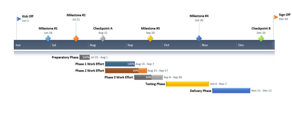
A Gantt chart is a tool used in project management. It’s a visual representation of deadlines, task progression, and the course of a project’s timeline. The visual representations used in Gantt charts resemble a bar graph in their construction and are therefore easily understood by people of all analytical backgrounds as a result of the common understanding that bar graphs enjoy across all groups.
A Gantt chart is unique in that it provides a timeline feature that is crucial for managing large and complex projects. Across the top of the chart, there’s a timescale that runs the length of the graph (and the corresponding project). Tasks are placed on the scale and their “bar” is plotted about the timeframe that it’s been given for both a start date and intended completion. This is easy to represent on the chart, as the start and end dates provide the beginning and ending points for each bar placed on the graph. A Gantt chart timeline is the perfect solution for many time-dependent project management tasks. It’s a great way to display information about all kinds of projects, and additional information can be built into the graph in intuitive and easy-to-understand ways.
Continue reading to learn more about Gantt charts in the project management and time management space.
Gantt charts offer simple context and information about individual tasks and details on how they fit into the project as a whole.

A Gantt chart is a crucial data visualization product for a number of key reasons, but none more important, perhaps, than the simplicity that these representations offer when it comes to portraying both content and context. Teams working together to make the most of a project are hindered by any number of unique barriers and issues. What’s more, in the modern world, many project teams are working at reduced interactive capacity as a result of COVID-19 health and safety measures.
Whether your team is working remotely or together in a single office space, the need to convey information on due dates, project timelines, and more is central to the success of the project itself. The simplicity with which this type of data chart can provide information to individuals working on pieces of the whole is unique and unrivaled by any other kind of data framework. With a Gantt chart, you can list out deadlines and time to completion on each integrated piece of the overall project, showing both when they will be worked on directly and how these discreet pieces fit into the larger picture of the entire project.
Project managers and data analysts benefit from this graphic representation in vast and notable ways.

Many project managers struggle with data governance and timetable adherence. With the help of this type of timeline and calendar management application, teams are better positioned to continue working diligently toward end goals and project completion. Understanding where an individual contributor’s work fits into the larger scale of things is a great way to ensure a better overall quality of work and transparency throughout the team.
Today, with team members working in hybrid, flex, and purely remote settings, the need for greater clarity of vision and message is more important than ever before. Businesses rely on continuity of workflows and team cohesion. With the help of a Gantt chart, ensuring that each member of the team understands their role is simple. This is because these visualization tools offer up more than simply a calendar of deadlines and timelines. With the help of shading, sizing, fonts, colors, and other stylistic elements, it’s easy to impart greater context and data inclusions that are easily understood by everyone on the team.
Consider this addition to your workflow for greater clarity today.
